

Container widget
Build any section layout on your landing page with one widget. Put things side by side, stack them up, or arrange them into columns and rows, then decide exactly how much space each widget takes.
Good to know
When you build a landing page, you are really deciding where things sit: what goes side by side, what stacks up, what lines up into columns. The Container widget is how you do all of it. Drop one in, put your widgets inside, and choose the mode that matches the look you want.
Which mode do I need?
| If you want to... | Use |
|---|---|
| Put a few widgets in a row or a stack | Flex mode |
| Group things and give them a shared background or border | Flex mode |
| Split a section into columns | Grid mode |
| Let one widget span 2 columns while others take 1 | Grid mode |
You switch between the two at any time under Layout in the settings panel.
Switching modes never loses your settings. Set up a grid, switch to Flex, come back, and your columns and spans are still there.
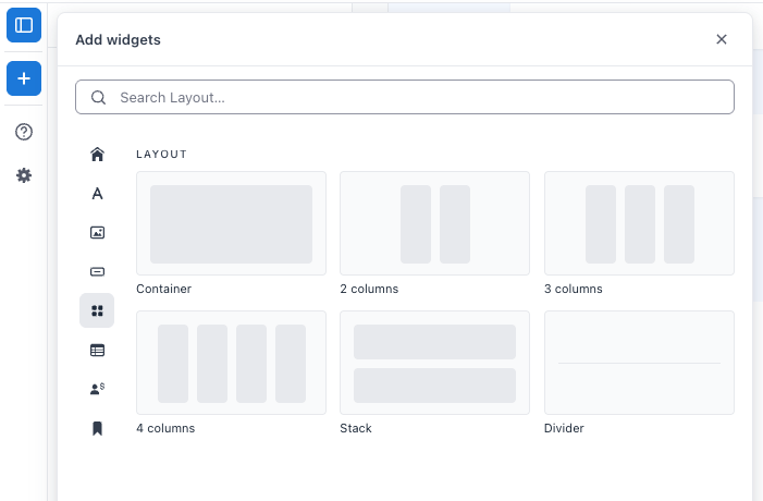
Five starting points under Layout in the Add panel. Two give you Flex mode, three give you Grid.
1 · Flex mode: put widgets in a row or a stack
Use case: a row of buttons, a logo beside a heading, or a stacked block of text that needs its own background.
Flex mode lines your widgets up one after another, either across the page or down it. Widgets flow in the order you place them, so it is the quickest way to group a handful of things together.
1. Add a Container or a Stack
Open the Add panel in the page editor and look under Layout. Pick Container for widgets side by side, or Stack for widgets one under the other. Drag it onto the page.
2. Drop your widgets in
Drag any widget into the Container. They line up in the order you place them, and you can drag them around to reorder at any time.
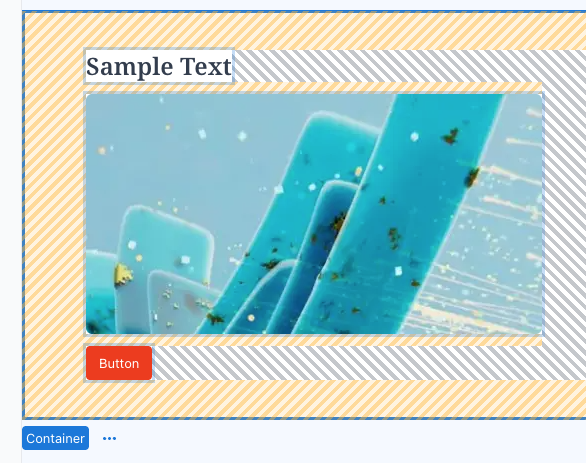
Three widgets in a horizontal Container.
3. Set the direction and spacing
Select the Container and use the settings panel:
| Setting | What it does |
|---|---|
| Direction | Horizontal or Vertical, so you can flip a Container into a Stack at any time. |
| Wrap | Lets widgets flow onto a new line when they run out of room. |
| Align | Where the whole group sits inside the Container, horizontally and vertically. |
| Gap | The space between widgets. |
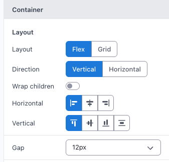
The Flex settings. One Gap value covers both directions.
4. Size an individual widget
Click a widget inside the Container and look at the Layout in container section at the top of its settings panel. Set its Size:
| Option | What you get |
|---|---|
| Fill | Shares the leftover space with the other Fill widgets. A Ratio field appears just below, which decides how big that share is. Two widgets both on Fill with a Ratio of 1 split the space evenly. Set one to 2 and it takes twice as much as the other. Decimals work too, so 1.5 is fine. |
| Fixed | An exact size in pixels. |
| Hug | Only as big as its own content. |
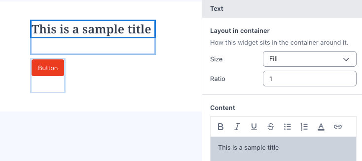
Set on the widget, not on the Container.
5. Style the Container
Still in the Container's settings panel you have Background, Padding, Border, Corner radius, Shadow, Width, Max width and Height.
2 · Grid mode: arrange widgets in columns and rows
Use case: a three column section, a card grid, or a full width heading sitting above a row of columns.
Grid mode lays your widgets out in columns and rows so everything lines up neatly, no matter how much content each one holds.
1. Add a column layout
Open the Add panel and look under Layout. Drag in 2 columns, 3 columns or 4 columns. Each one is a Container already set to Grid mode, so it works straight away.
You can also drop in a plain Container and switch Layout to Grid in the settings panel. It starts with 2 equal columns.
2. Drop your widgets straight into the columns
Drag any widget into a column. There is no wrapper to add first, and no widget type is off limits.

A three column Container with content in each column.
3. Set up your columns
Select the Container and use the Columns list. + adds a column, up to 12. − removes one, as long as one column remains. Each column can be sized:
| Option | What you get |
|---|---|
| Fill | Shares the leftover space with the other Fill columns. A Ratio field appears just below, which decides how big that share is. Two Fill columns both on a Ratio of 1 are equal width. Set one to 2 and it becomes twice as wide as the other. |
| Fixed | An exact width in pixels. |
| Hug | Only as wide as the content inside it. |
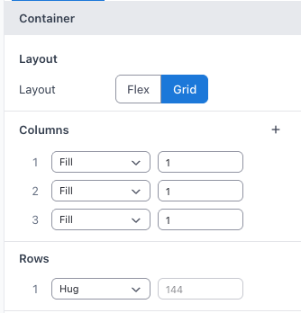
The Columns list. Mix Fixed and Fill to get a sidebar beside a flexible content area.
4. Set the spacing
Grid mode splits spacing in two: Column gap for the space between columns, and Row gap for the space between rows.
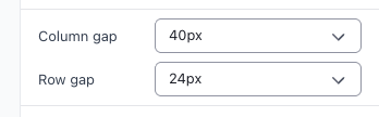
How rows are created
Rows are not something you add. They appear on their own as you fill the grid.
- Widgets fill the first row from left to right.
- When a row runs out of columns, the next widget starts a new row.
- If a widget is too wide for the space left in a row, it moves down and starts the next row instead of squeezing in. The space above it stays empty.
- Add more widgets and more rows keep appearing. Delete widgets and the rows disappear again.

Five widgets in a three column Container: three in row 1, two in row 2. The second row appeared on its own.
Because rows come from your content, the Rows list has no + button. What you can do there is:
Set a row's height
Fill, Fixed or Hug, the same options as a column.
Delete a row
Only rows sitting past your content can be deleted. A row holding a widget will still be there after you click delete.

The Rows list sets heights. Rows themselves come from your widgets.
Decide how much space each widget takes
This is set on the widget, not on the Container.
1. Click the widget inside the Container
Its own settings panel opens on the right.
2. Find the Layout in container section
It sits at the top of the panel, above the widget's own settings.
3. Set the span and alignment
| Setting | What it does |
|---|---|
| Column span | How many columns the widget covers, from 1 up to the number of columns in the Container. |
| Row span | How many rows the widget covers, from 1 up to 6. |
| Horizontal | Where it sits inside its own cell, left to right. |
| Vertical | Where it sits inside its own cell, top to bottom. |

Spans and alignment for one widget inside a grid.

A heading with a Column span of 3 takes the whole first row, pushing the cards into row 2.
To move a widget somewhere else in the grid, drag it to a different position among the other widgets. Widgets are placed in order, so the order decides where each one lands. You cannot pin a widget to a specific cell.
3 · Build richer sections by nesting Containers
Use case: a two column section where the left column holds a heading, a paragraph and a button, neatly stacked.
Most real sections are not a plain grid. The easiest way to build one is to put a Container inside a Container, so each one only has to solve its own small layout problem.
For the example above: a Grid Container with 2 columns, and inside the left column a Stack holding the heading, the paragraph and the button. The grid handles the split, the stack handles the vertical rhythm.
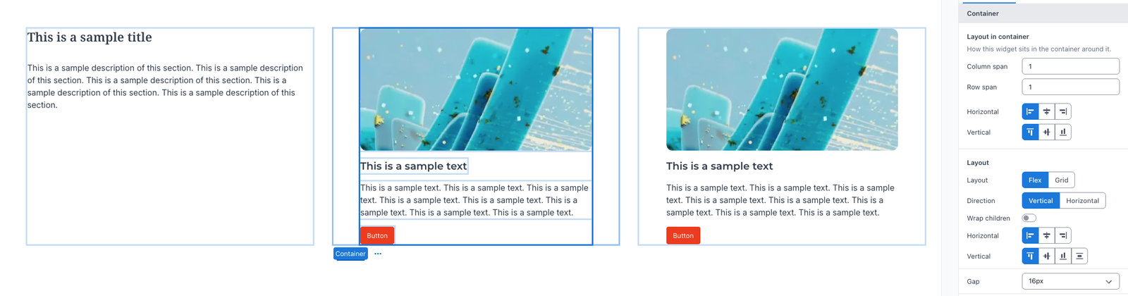
A Stack nested inside one column of a Grid Container.
For a card grid, make each card its own Stack Container, then drop the cards into a Grid Container. Every card stays consistent and the grid handles the arrangement.
Two more habits worth picking up:
- Use Gap instead of empty space. The Container's Gap and Padding, plus the Margin on Text and Button widgets, keep spacing tidy when content changes.
- Start from the closest tile. It is quicker to drop in 3 columns and remove one than to build a grid from scratch.
Good to know
- Reducing the number of columns adjusts existing spans. If a widget spans 3 columns and you drop the Container to 2 columns, that widget now spans the full 2. Your layout stays intact rather than overflowing.
- Alignment works differently in each mode. In Flex mode you align the whole group from the Container. In Grid mode you align each widget from its own Layout in container section.
- Check every screen size before you publish. Column setups, gaps and spans are saved per screen size, so a section that looks right on desktop can be cramped on mobile. Switch between the screen sizes in the builder and adjust each one until the section reads well on all of them.
- Bigger screens cascade down to smaller ones. What you set on a larger screen size carries over to the smaller ones automatically, so set up desktop first and then only change what needs to be different on tablet and mobile. Anything you change on a smaller screen size stays local to that one and does not affect the bigger ones.
- Older pages keep working. If a page was built with the earlier Box or Column widgets, it keeps rendering and stays editable. There is no automatic conversion, so rebuild those sections with Containers when you next touch them.