

Data room widget
Show contacts the data rooms they can access, as rows, cards or a carousel.
Give contacts a quick way into their data rooms right from your landing page. Each contact sees only the data rooms they have access to, shown as rows, a grid of cards, or a carousel.
Where to find it: in the landing page builder, under the Investor widgets or the Data Room section templates.
1 · Add the widget to your page
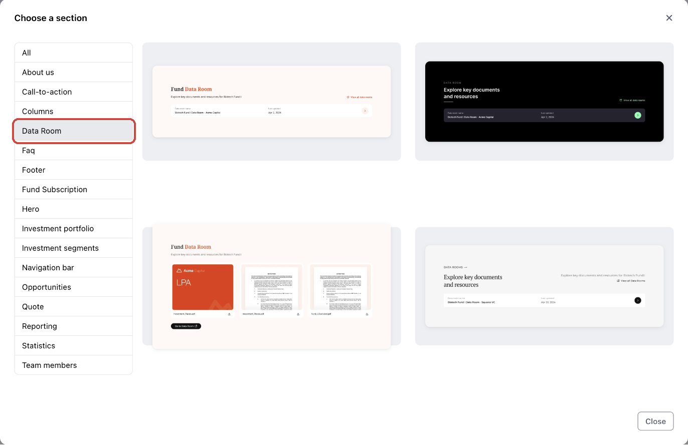
1. Start from a ready-made section
Click the section that should sit above the new one, then click Add Section → Template section. In the Choose a section dialog, select the Data Room category and pick a layout. Each template comes with a heading, a short description and the widget.
2. Or add just the widget
Open the Add widgets panel (the + icon in the left toolbar), go to the Investor category and add Data room.
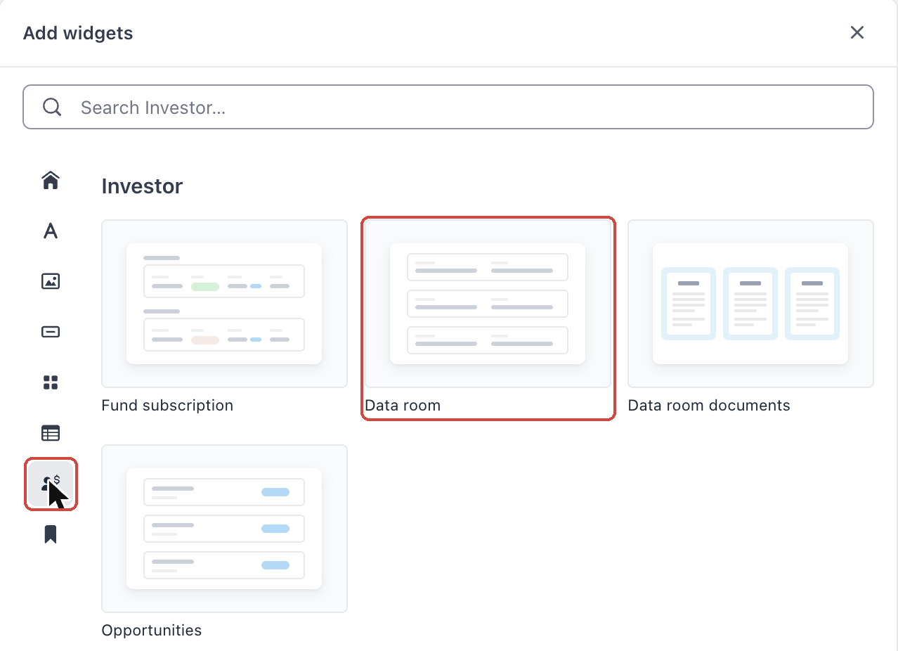
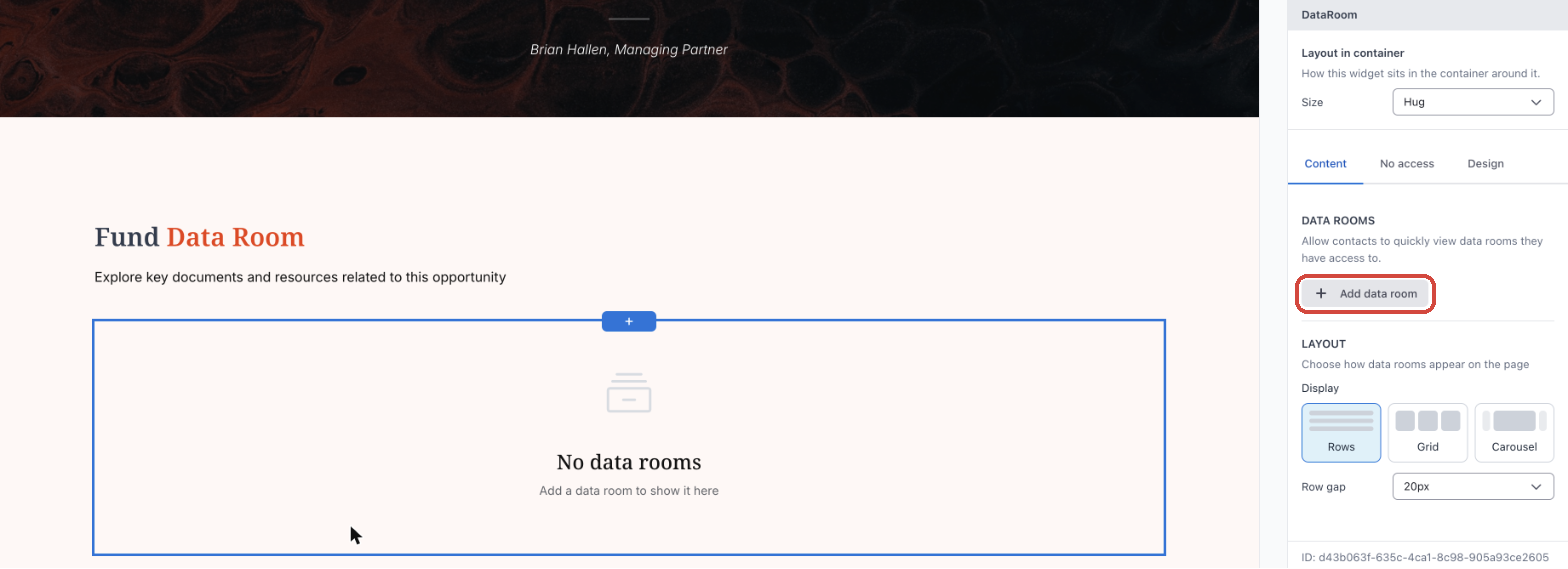
Tip: When you select the widget, its settings panel is titled DataRoom. Until you add a data room, the widget shows No data rooms on the canvas.
2 · Choose which data rooms to show
1. Add your data rooms
Select the widget. On the Content tab, under DATA ROOMS, click Add data room.
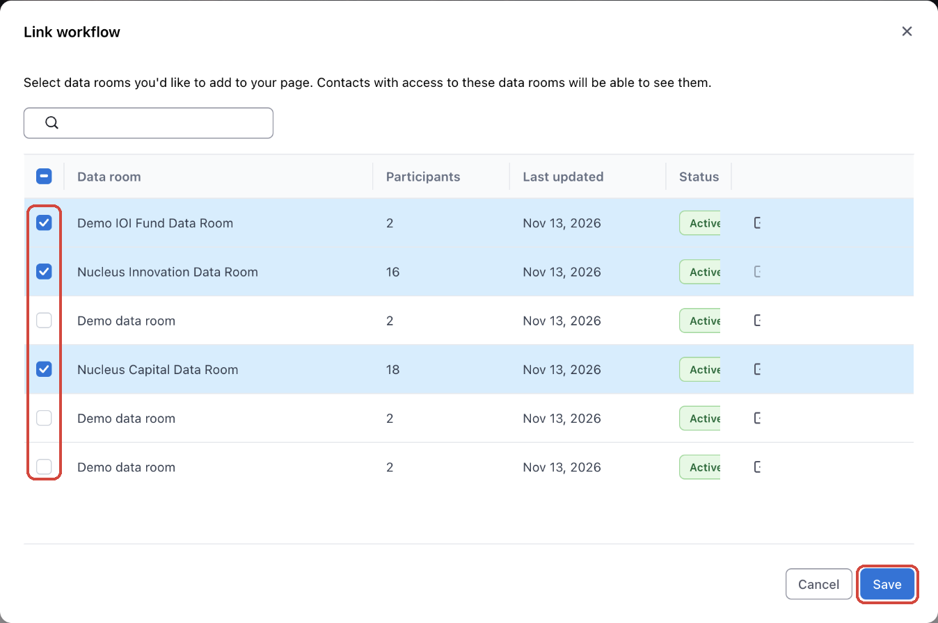
In the Link workflow dialog, tick the data rooms to show and click Save. The list shows how many participants each data room has, when it was last updated and its status. Contacts with access to these data rooms will be able to see them.
Tip: If a data room you expect isn't in the list, contact your Anduin representative.
2. Reorder or remove data rooms
Drag a data room by its handle to change the order on the page, or click the × next to it to remove it from the widget. Removing it from the widget doesn't change the data room itself or who can access it.
Note: If a data room has expired, the builder marks it with This data room has expired. Contacts can't see it. Contacts won't see an expired data room on the page.
3 · Pick a layout
Under LAYOUT, choose how data rooms appear on the page.
| Display | What contacts see | Settings |
|---|---|---|
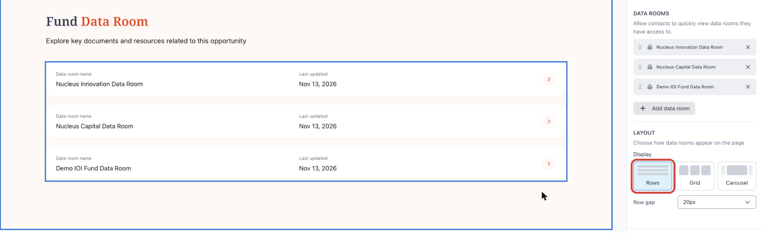
| Rows | One full-width row per data room with its name, last-updated date and an arrow | Row gap |
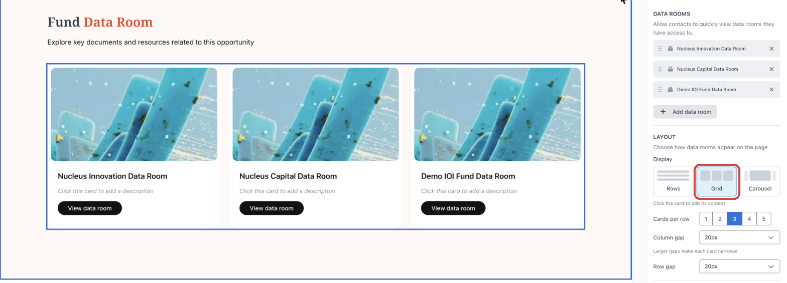
| Grid | Cards laid out in columns, each with an image, name, description and button | Cards per row (1–5), Column gap, Row gap |
| Carousel | Cards in a single row that contacts page through with arrows and dots, plus a count such as "Showing 1–2 of 3" | Allow switching to grid view, Cards per row (1–5), Column gap |
Rows
Grid
Carousel
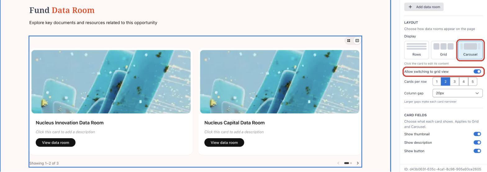
Tip: Larger gaps make each card narrower. In Carousel, leave Allow switching to grid view on to give contacts a small switcher so they can see all their data rooms at once.
Choose what each card shows
Under CARD FIELDS, turn Show thumbnail, Show description and Show button on or off. These apply to Grid and Carousel only. With all three off, each card shows just the data room name.
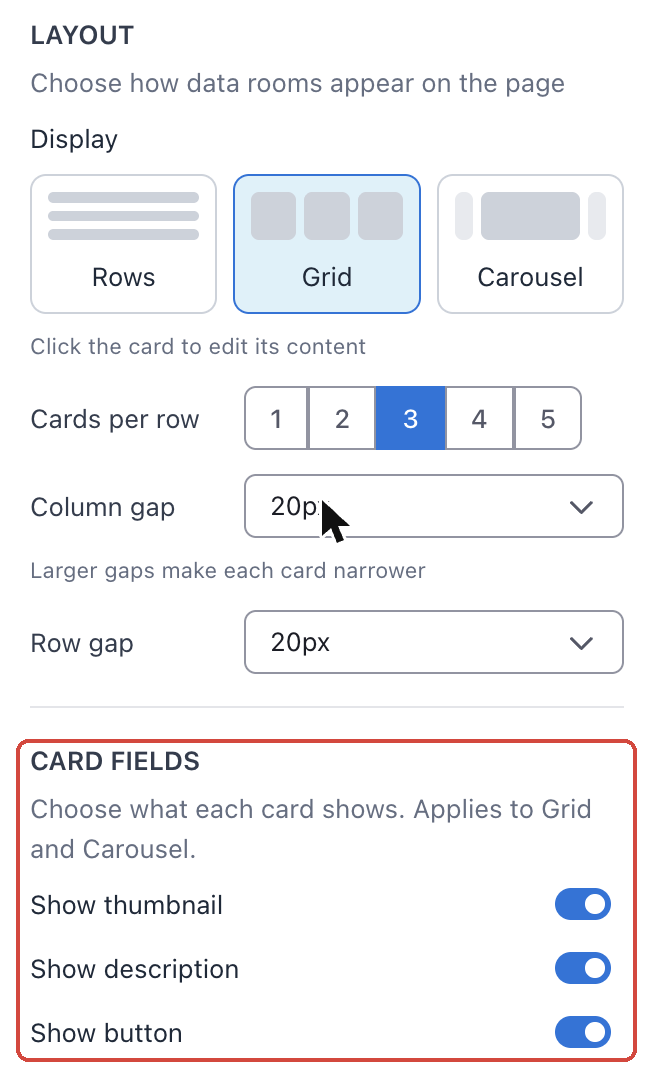
4 · Edit each card
In Grid or Carousel, click a card on the canvas to open Edit data room card. Changes apply to that card only.
| Setting | What you can do |
|---|---|
| Card image | Click Replace to upload your own image. Use an image at least 370px wide. |
| Data room name | Always matches the data room. To change it, click Rename it in data room settings. |
| Data room description | Add a short description shown under the name. |
| Card button | Change the button text (default: View data room). |
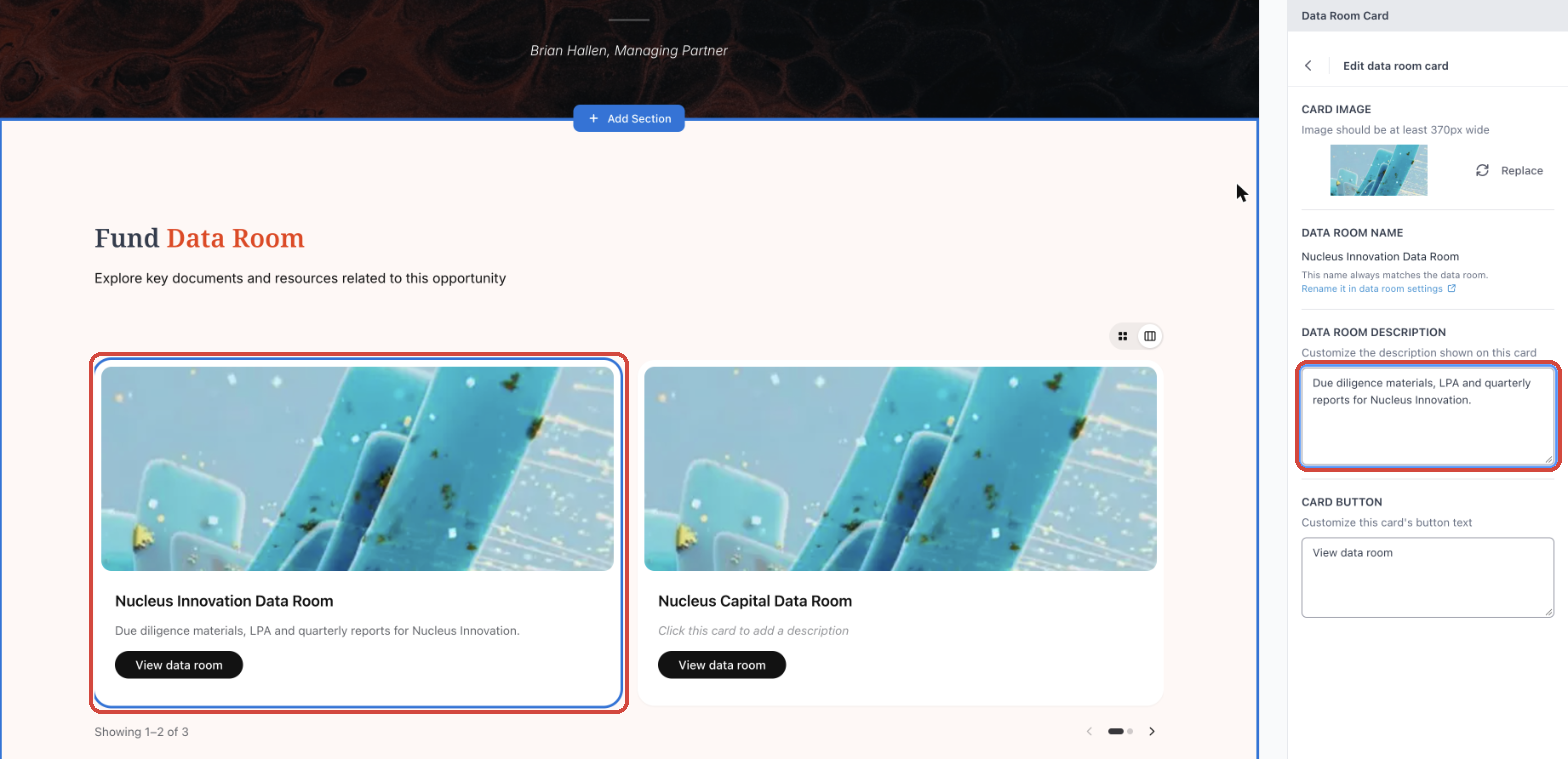
Click the back arrow at the top of the panel to return to the widget settings.
5 · Set what contacts without access see
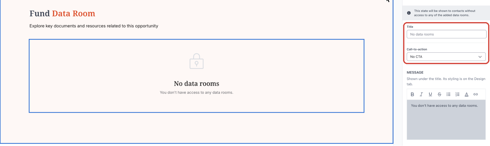
Contacts who don't have access to any of the added data rooms see a placeholder instead of an empty space. Open the No access tab to set it up. While this tab is open, the canvas shows the placeholder so you can see what you're writing.
| Setting | What it does |
|---|---|
| Title | The heading of the placeholder. Leave it empty to use No data rooms. |
| Call-to-action | No CTA shows no button. Custom URL adds a button: enter its label and the link it opens. |
| Message | Text shown under the title, for example who to contact for access. Default: You don't have access to any data rooms. |
Tip: To control who can see the page itself, see Manage who can see your landing pages.
6 · Style the widget
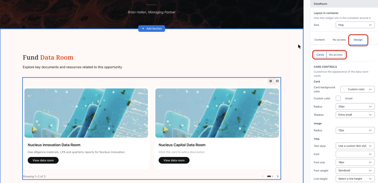
Open the Design tab. Use the Cards / No access switch at the top to choose which state you're styling. The groups you see depend on the layout you picked.
| Group | Shown for | What you can style |
|---|---|---|
| CARD CONTROLS | Grid, Carousel | Card background, radius and shadow; image radius; title and description text; button text, colors, hover colors, border, radius, shadow and alignment |
| CAROUSEL CONTROLS | Carousel | Count text, view switcher colors, page dot colors and arrow color |
| ROW CONTROLS | Rows | Background, label and value text colors, arrow icon and circle colors |
| No access | All layouts | Placeholder background, radius, icon color, and title and message text |
7 · What contacts see
- Each contact sees only the added data rooms they have access to, in the order you set.
- Clicking a row, card or button opens that data room.
- Contacts without access to any of the added data rooms see the No access placeholder.
- Remember to Save changes and Publish the page so contacts see your updates.