

Data room documents widget
Feature up to 20 data room documents as cards on your landing page. Each investor sees only the files they have permission to view.
Put your key data room documents right on your landing page. Investors can open them without leaving your page, and each investor only sees the files they have permission to view.
The Data room widget links investors to a whole data room. The Data room documents widget goes one step further: you pick up to 20 files from one data room and show them as cards on your page, such as a pitch deck, an LPA or a fund overview. Investors click a card to open the document. It respects everything you've already set up in the data room: permissions and terms of access still apply.
1 · Add the widget to your page
Use case: add a "Fund Data Room" section with a heading, a short intro and your featured documents.
1. Select the section above where the documents should go
In the landing page builder, click the section that should sit just above your new one. An Add Section button appears on its bottom edge.
2. Choose a Data Room template
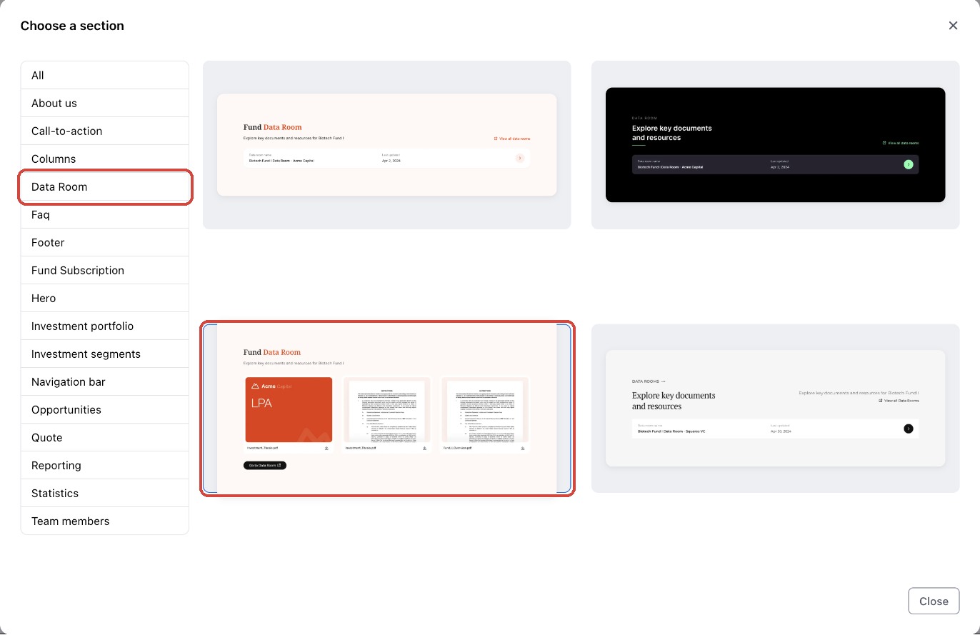
Click Add Section, then Template section. In the Choose a section dialog, select the Data Room category and click the template that shows document cards.
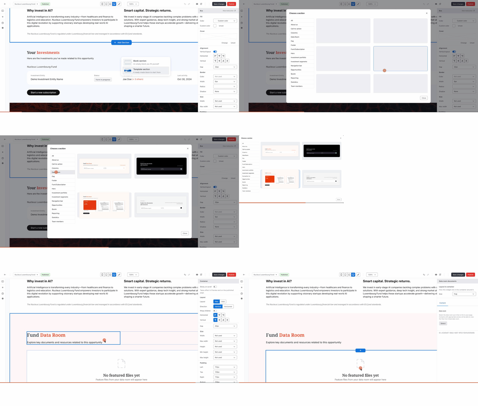
The section is added to your page with a heading, a short description and an empty Data room documents widget that says No featured files yet. Click the heading and description to replace them with your own text.
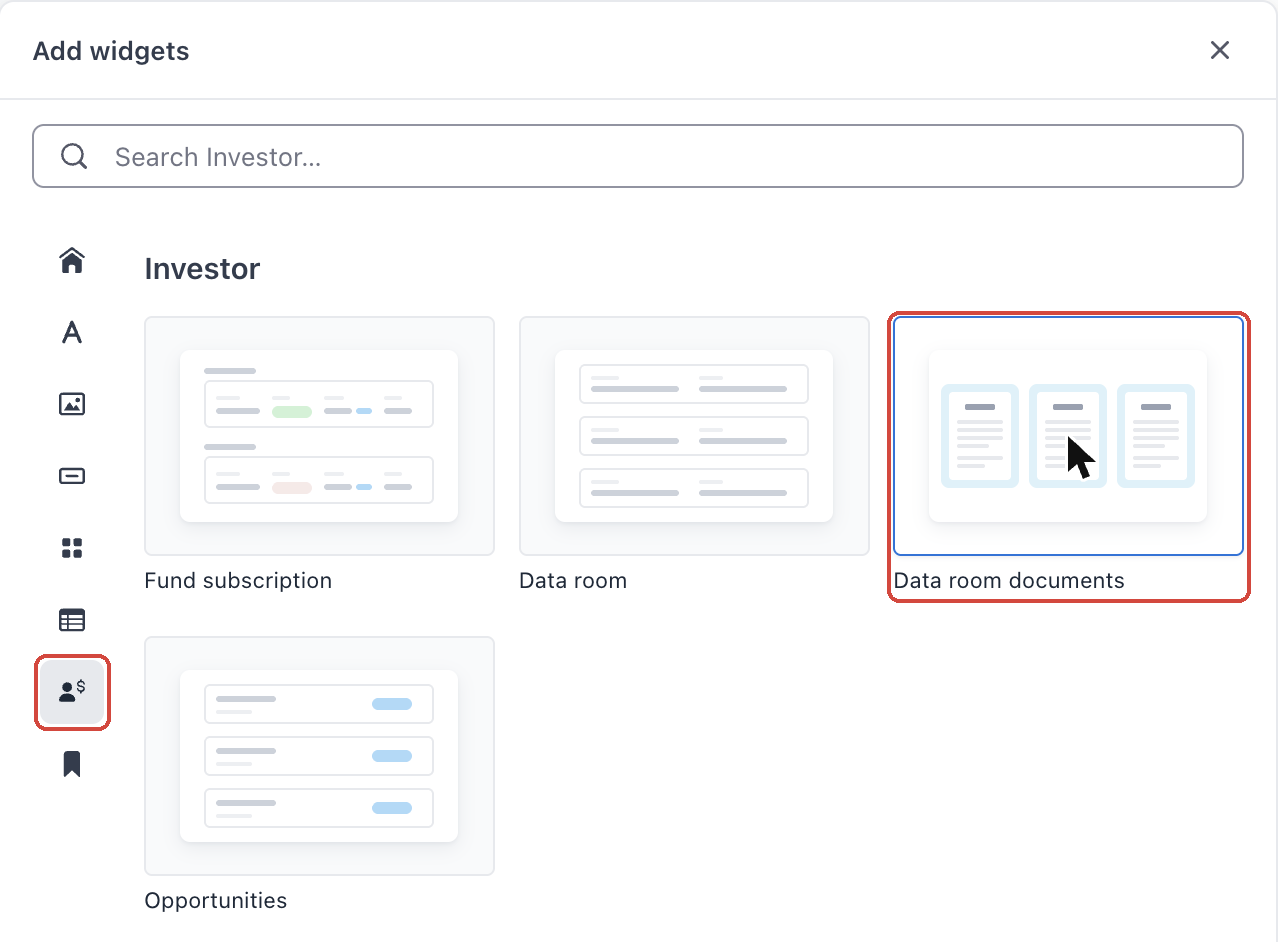
Tip: Already have a section you want to use? Open the Add widgets panel (the + icon in the left toolbar) and find Data room documents under the Investor category.
Watch it in action: adding a Data Room template section and selecting the widget.
2 · Connect a data room and choose the files to feature
Use case: feature your fund records and strategy documents from the fund's data room.
1. Select the data room
Click the widget to open its settings on the right. On the Content tab, under Data room, click Select. Choose a data room in the Select a data room dialog and click Add.
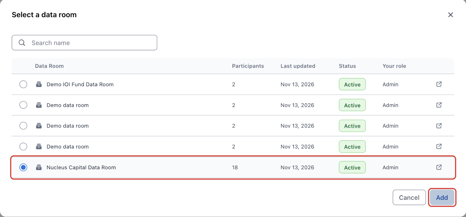
Tip: You need Admin access to a data room to connect it. Each widget connects to one data room.
2. Pick the files to feature
Under Featured files, click Add files. In Manage featured files, open the folders and tick the documents you want, up to 20. Click Save. The documents appear as cards on your page right away.
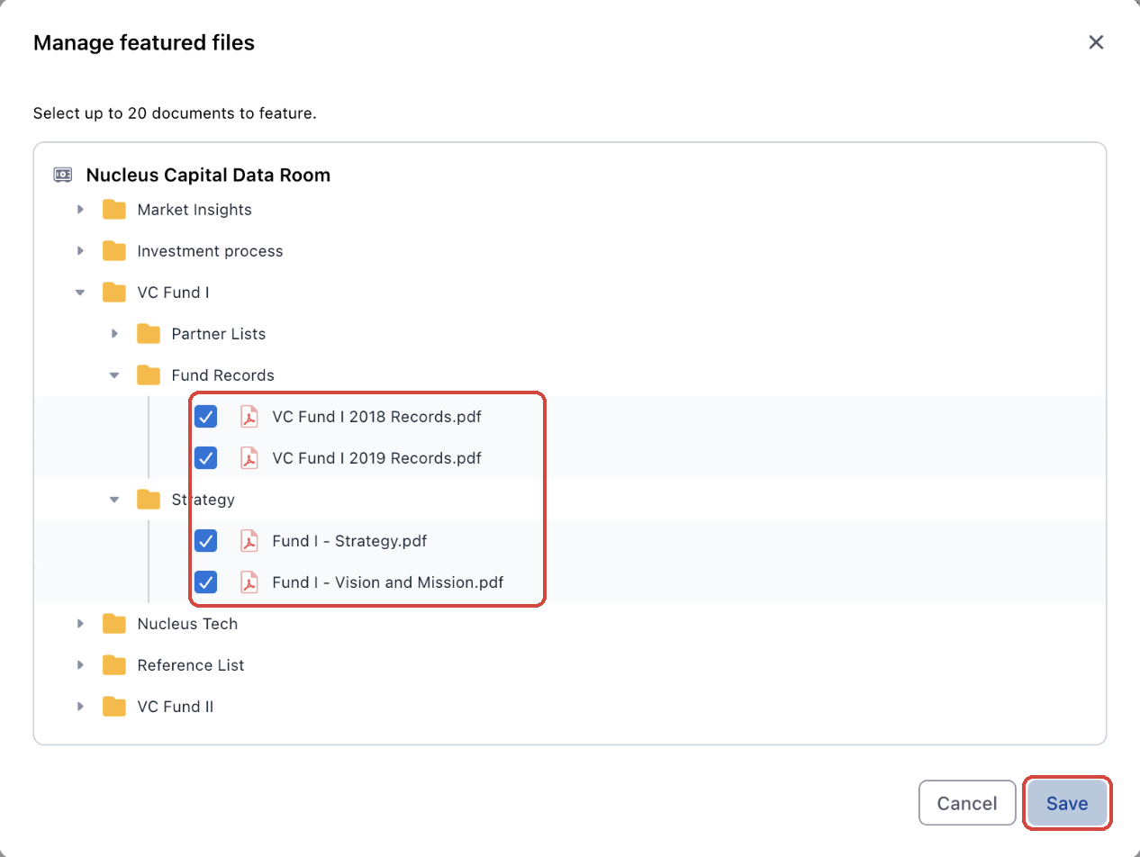
3. Reorder, preview or remove files
Your files are listed under Featured files in the order they appear on the page. Drag a file by its handle to move it. Click the eye icon to preview a file, or the × to remove it. To add or remove several files at once, click Manage.
3 · Help investors know what they're opening
Use case: add a cover image and a one-line summary so investors can tell documents apart before they open them.
1. Add a short description to each document
Under Featured files, turn on Show description. A text box appears under each file. Type a short description of up to 150 characters, and it shows under the file name on the card.
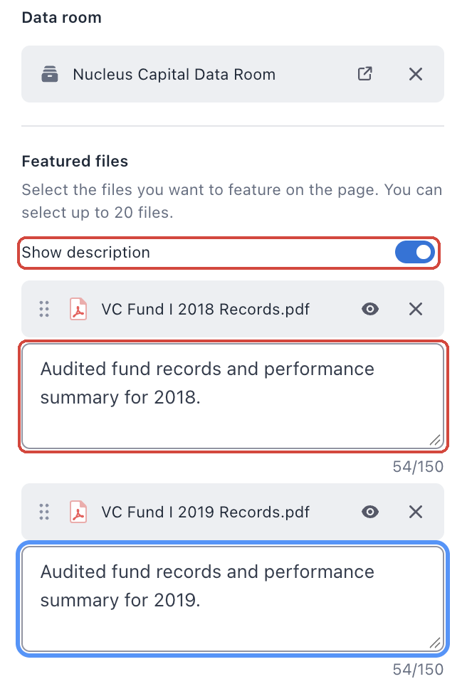
Tip: Every card keeps the same height, whether its description is long, short or empty. Text longer than three lines ends with "…", and investors see the full text when they hover over it. Turning Show description off hides the descriptions but keeps what you typed.
2. Change a card's thumbnail
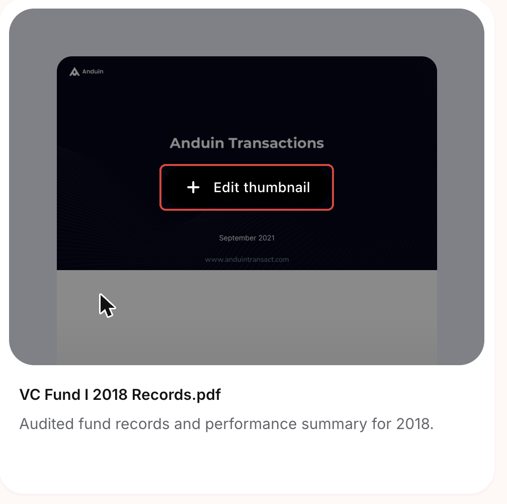
Each card shows a thumbnail generated from the document. To use your own image, hover over the card on your page and click Edit thumbnail. Upload a JPG, PNG or WEBP image under 5 MB (400 × 300 px works best), then drag it to reposition it.
4 · Show documents as a grid or a carousel
Use case: you're featuring a lot of documents and want the section to stay compact.
1. Choose Grid or Carousel
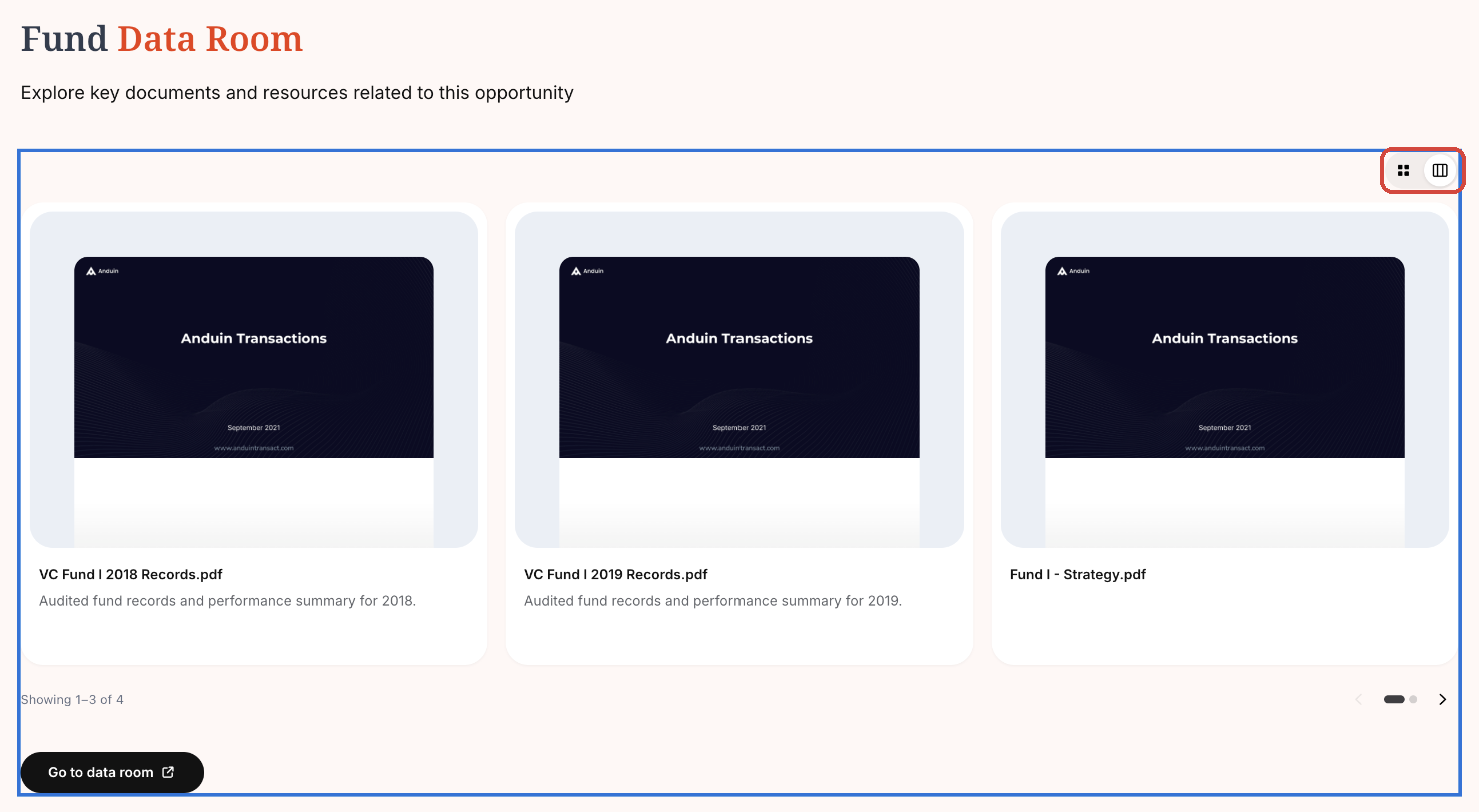
On the Content tab, go to Layout and pick a Display option. Grid shows every card at once, in rows. Carousel shows one row, and investors page through it with arrows.
2. Set how many cards sit in a row
Pick 1 to 5 under Cards per row. In a carousel, this is how many cards show at a time. Adjust Column gap to change the space between cards, and in Grid, Row gap to change the space between rows.
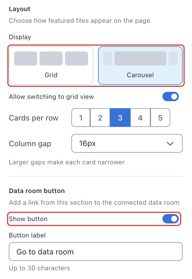
Tip: Cards per row is saved separately for each screen size. Use the screen size buttons at the top of the builder to set it for desktop, laptop, tablet and mobile. By default it's 3 on desktop and laptop, 2 on tablet and 1 on mobile.
3. Decide whether investors can switch to a grid
With Carousel selected, Allow switching to grid view is on by default. It adds a small switcher above the cards so investors can see every document at once. Their choice is remembered the next time they visit. Turn it off to keep the carousel fixed.
To match the carousel's count, arrows, dots and switcher to your brand, open the Design tab and use CAROUSEL CONTROLS.
Watch it in action: switching from Grid to Carousel and changing the cards per row.
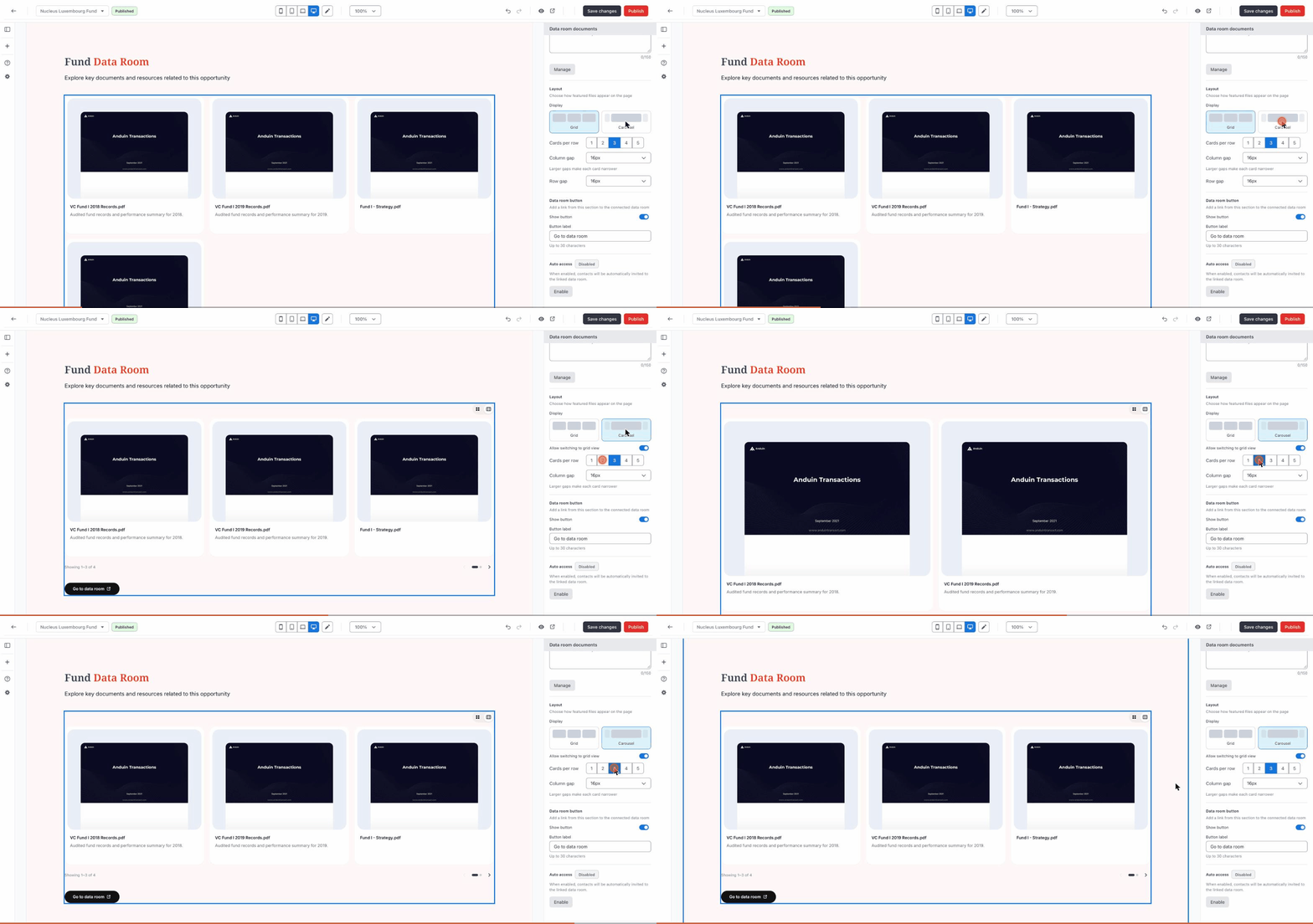
Tip: On the builder canvas, the carousel arrows and the switcher are shown but you can't click them. Use Preview to try them as an investor would.
5 · Keep investors on your page
Use case: your data room is shared across several pages, and you want investors to read the documents you featured here, not browse the whole data room.
1. Hide the data room button
By default, the widget shows a Go to data room button that opens the connected data room. To remove it, go to Data room button on the Content tab and turn off Show button.
2. Or rename it
If you keep the button, change its text under Button label, up to 30 characters. If you turn the button off and back on later, your label is still there.
Watch it in action: turning off Show button removes the button from the page.
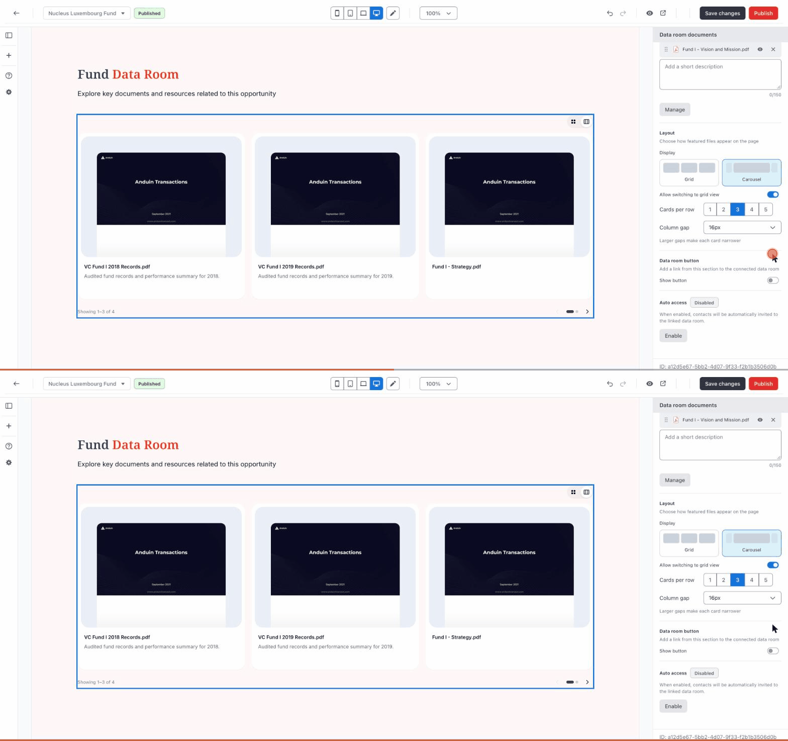
Tip: Hiding the button doesn't change anyone's access. Investors still see only the featured files they have permission to view.
6 · Give visitors access automatically
Use case: you invite investors to the landing page and want them to see the featured documents without inviting each one to the data room separately.
1. Open the auto access settings
At the bottom of the Content tab, Auto access shows as Disabled. Click Enable.
2. Choose what visitors receive, then enable
Visitors with the right access are invited to the data room as an Observer and given access to the featured files. Under File permissions, choose View or View & Download. Tick Require acceptance of the terms of access if visitors must accept the data room's terms before they can see the documents. Click Enable.
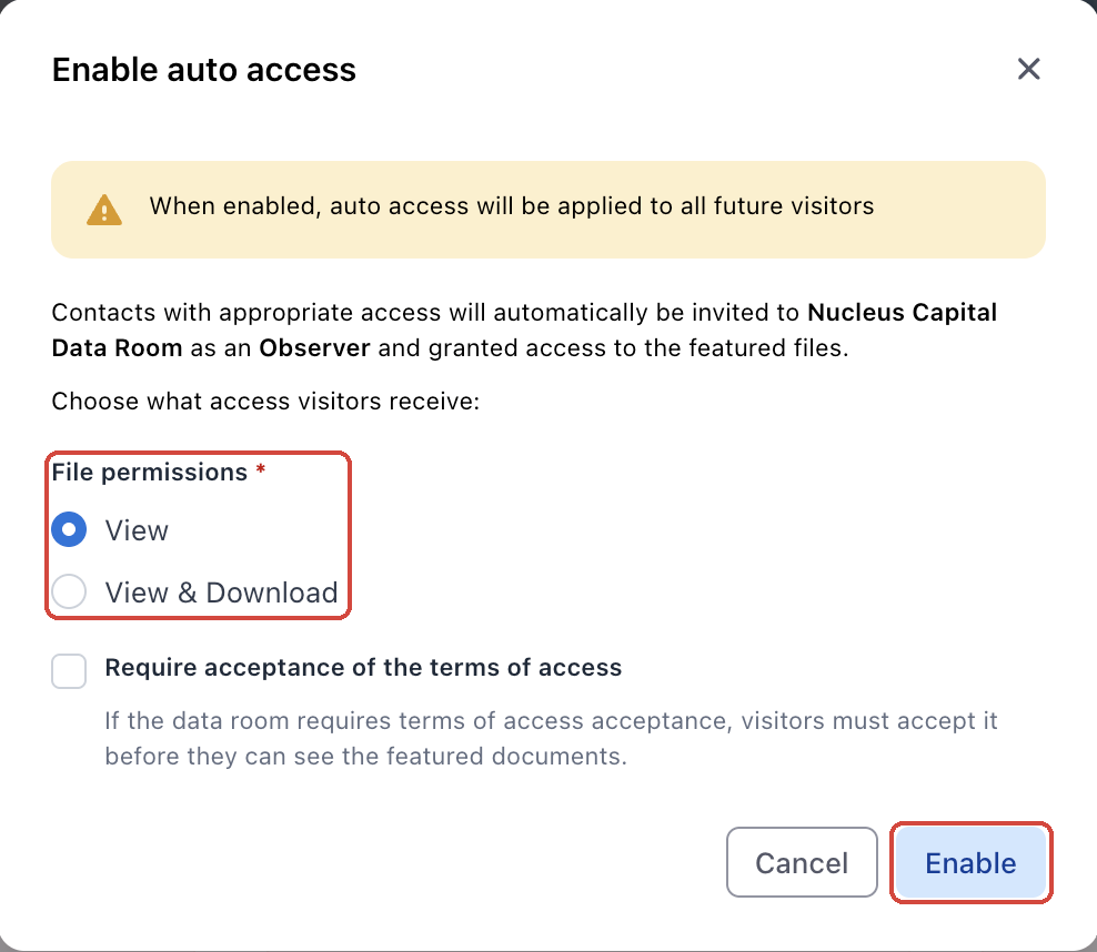
Tip: You need Admin access to the connected data room to turn auto access on, change it or turn it off. Turning it off stops new visitors from being invited automatically. People who already have access keep it.
7 · Decide what visitors without access see
Use case: some visitors aren't permitted to see these documents, and you want to tell them how to get access instead of showing an empty space.
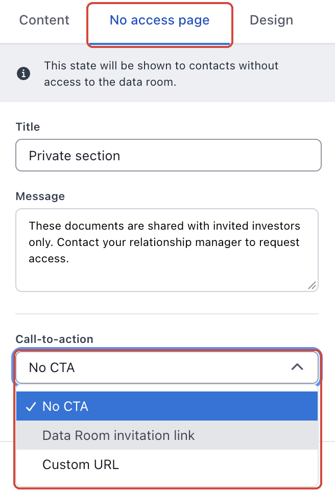
1. Open the "No access page" tab
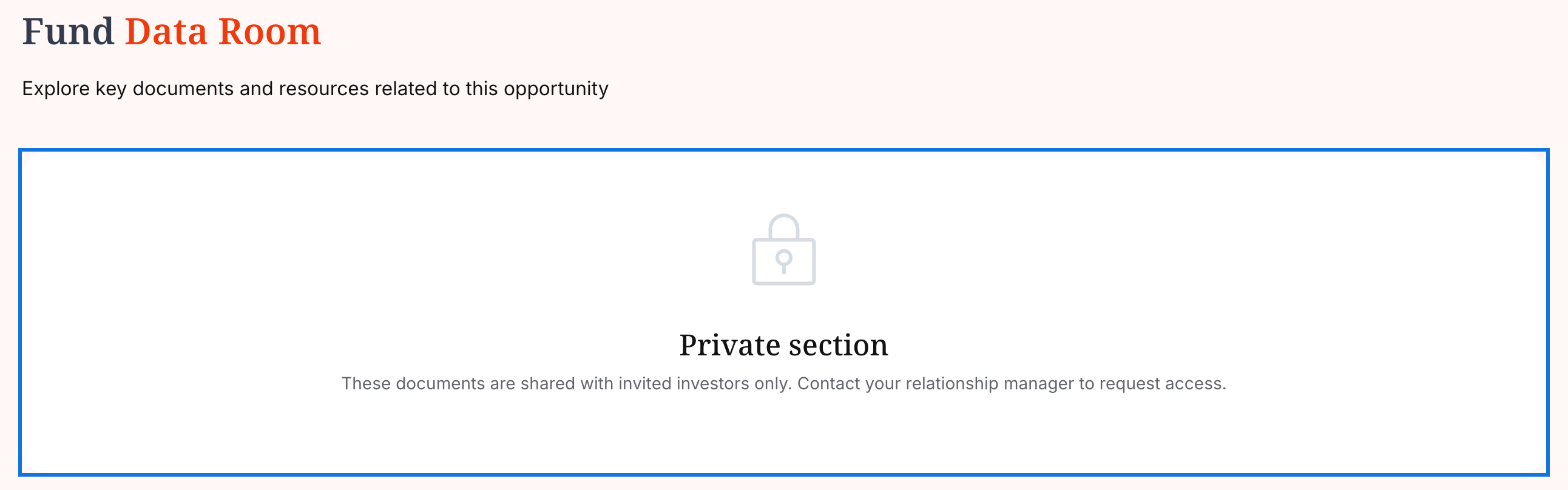
At the top of the widget's settings, switch to No access page. While this tab is open, the canvas shows what a visitor without access would see.
2. Write a title and message, and add a call to action
Fill in a Title and Message. Under Call-to-action, choose No CTA, Data Room invitation link (then pick a link) or Custom URL to send visitors to your own page.
To change the colors and text styles of this state, use the no access settings on the Design tab.
Good to know
- Investors see only what they're allowed to. If an investor can access some of the featured files, they see just those. If they can't access any, they see your no access state.
- Terms of access still apply. If the data room requires investors to accept its terms of access, investors who haven't accepted are asked to review and accept them before the documents appear.
- Changing the data room clears your featured files. To connect a different data room, click the × next to the current one and select a new one. Your design settings are kept, but auto access is turned off, so choose your files again and turn auto access back on if you need it.
- Grid and carousel share one setting. Switching between them keeps your cards per row and spacing, so you don't have to set them again.
- See who opened what. Document opens from this widget show up in your landing page's Insights.