

FAQ widget
Public
quick answersinquiry tool
Introduction Use the FAQ widget to present common questions and answers in a clean, interactive format. This helps address investor concerns ahead of time
Introduction
Use the FAQ widget to present common questions and answers in a clean, interactive format. This helps address investor concerns ahead of time and reduces back-and-forth communication.
Where to find this feature
Go to the Section Template Library, search for “FAQ”, then select a template and add it to your page.
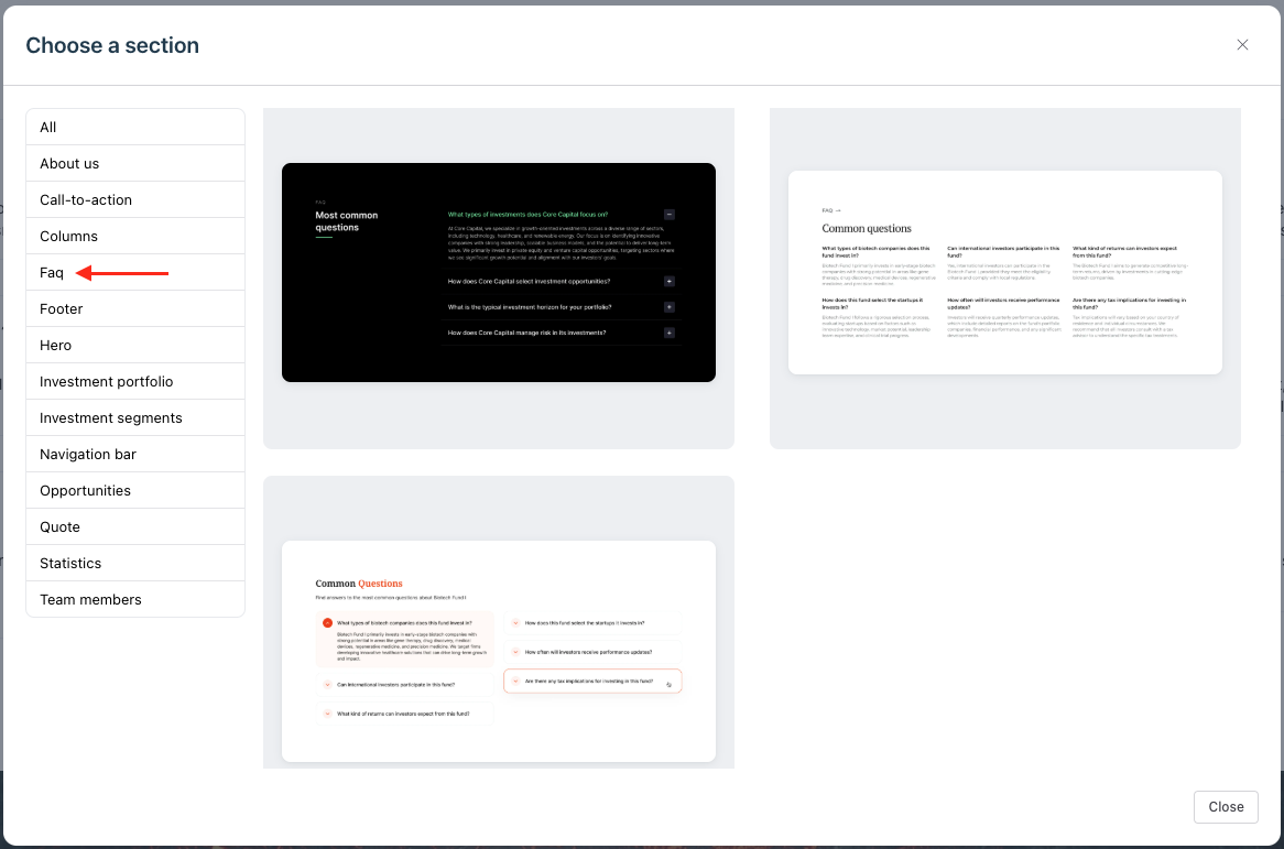
Customize the FAQ content
- Click on any Text widget inside the FAQ section.
- Replace the default text with your own question and answer.
Style the FAQ Item container
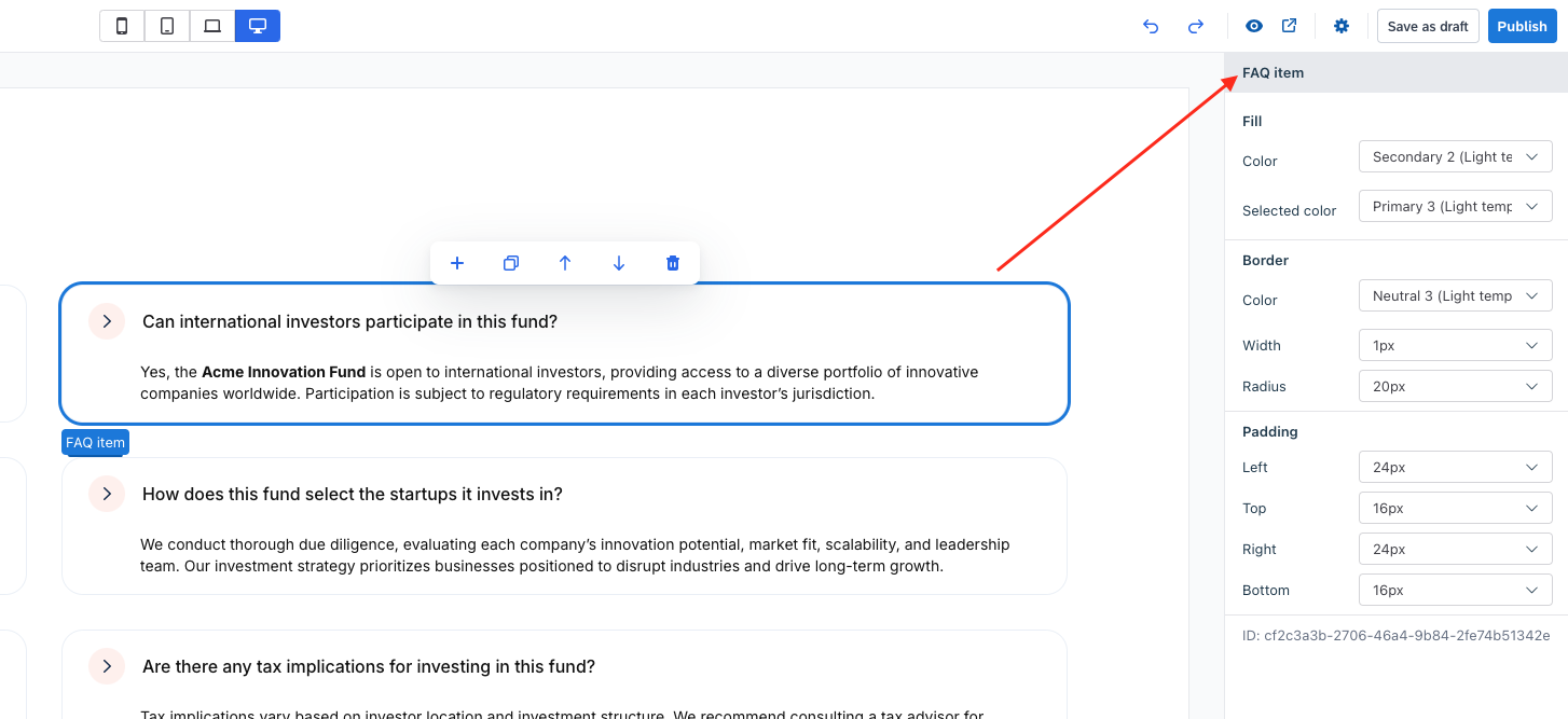
Select the FAQ item widget (the container for each Q&A pair).
Customize the following:
Fill
- Color: Choose a background color or leave as “Not used” for transparency.
- Selected color: Optional – applies when the item is active or expanded.
Border
- Color: Select a border color.
- Width: Set border thickness (e.g. 1px).
- Radius: Adjust corner roundness (e.g. 20px for pill-like edges).
Padding
- Defines the space inside the FAQ item: Left/Right/Top/Bottom
Style the FAQ Toggle Button
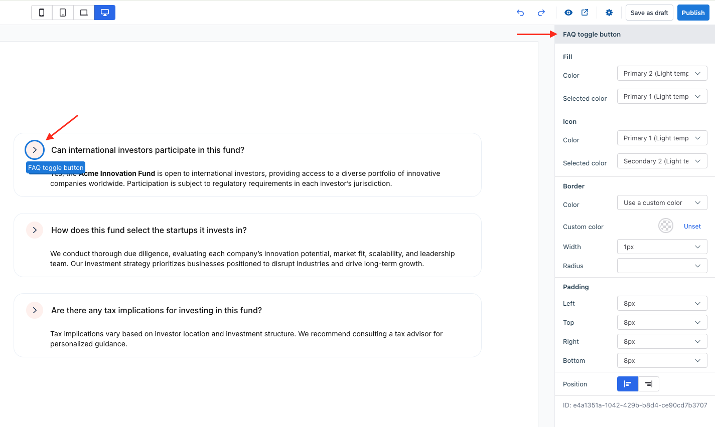
Select the FAQ toggle button widget (the clickable button that expands/collapses the answer).
Customize the following:
Fill
- Color: Set the button background color.
- Selected color: Set background color when the item is active.
Icon
- Color and Selected color: Customize icon colors in normal vs. expanded state.
Border
- Color: Choose from preset options or use a custom color.
- Custom color: Manually pick a border color.
- Width: Set the border thickness.
- Radius: Round the corners as needed.
Padding
- Adjust spacing around the button
Position
- Align the toggle icon to the left or right of the question text.
Was this page helpful?